حرف s طويل
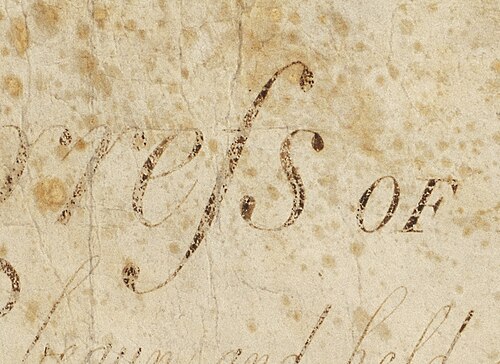
الحرف s الطويل ، ⟨ſ⟩ ، المعروف أيضًا باسم s الوسطي أو s الابتدائي ، هو شكل قديم من الحرف الصغير ⟨s⟩ ، ويوجد غالبًا في أعمال تعود إلى أواخر القرن الثامن وأوائل القرن التاسع عشر. وقد حلّ محل أحد الحرفين s أو كليهما [ a ] في تسلسل الحرفين s ( على سبيل المثال، "ſinfulneſs" بمعنى "sinfulness" و"poſſeſs" أو "poſseſs" بمعنى " possess "، ولكن ليس "poſſeſſ" أبدًا). [ 1 ] يُعرف شكل الحرف ⟨s⟩ الحديث باسم s "القصير" أو "النهائي" أو "المستدير" .
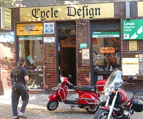
في فن الطباعة، يُعرف حرف السين الطويل بنوع من حروف الزخرفة ، ويُشار إليه عادةً باسم "حرف السين المزخرف " . [ 2 ] وكما هو الحال مع الحروف الأخرى، قد يختلف شكل حرف السين الطويل باختلاف نوع الخط: ſ ، ſ ، ſ ، ſ . في بعض أنواع الخطوط، يشبه هذا الحرف حرف ⟨f⟩ (حرف F صغير ) ، ولا يختلف عنه إلا في عرض العارضة الأفقية.
يشكل حرف s الطويل أساس النصف الأول من الحرف الألماني المركب ⟨ß⟩ [ 3 ] ( Eszett أو scharfes s ، ' حرف s حاد ' ) وحرف s الاسكتلندي الأوسط ⟨Ꟗꟗ⟩ . [ 4 ]
قواعد
إنجليزي
لا تُعدّ هذه القائمة من القواعد الخاصة بحرف السين الطويل شاملة، وهي تنطبق فقط على الكتب المطبوعة خلال الفترة من القرن السابع عشر إلى أوائل القرن التاسع عشر في البلدان الناطقة باللغة الإنجليزية. [ 1 ] توجد قواعد مماثلة للغات أوروبية أخرى. [ 1 ]
كان يتم استخدام حرف s الطويل دائمًا ( ſong ، ſubſtitute )، باستثناء:
- الأحرف الكبيرة هي دائماً حرف S المستدير؛ لا يوجد حرف s طويل كبير .
- A round s was always used at the end of a word ending with ⟨s⟩: his, complains, ſucceſs
- However, long s was maintained in abbreviations such as ſ. for ſubſtantive (substantive), and Geneſ. for Geneſis (Genesis).
- Before an apostrophe (indicating an omitted letter), a round s was used: us'd and clos'd.
- Before or after an f, a round s was used: offset, ſatisfaction.
- In the 17th and early 18th centuries, the round s was used before k and b: ask, husband, Ailesbury, Salisbury, Shaftsbury;[5] in the late 18th century, the long s was used instead: aſk, huſband, Aileſbury, Saliſbury,Shaftſbury.
- These two exceptions applied only if the letters were physically adjacent on the page, and long s was used if the two were separated by a hyphen and line break, e.g., off-ſet, Saliſ-bury.
- There were no special exceptions for a double s. The first s was always long, while the second was long in mid-word (e.g., poſſeſſion), or short when at the end of a word (e.g., poſſeſs). See, for example, the word Bleſſings in the Preamble to the United States Constitution.
- This usage was not universal, and a long followed by a short s is sometimes seen even mid-word (e.g., Miſsiſsippi).[6]
- Round s was used at the end of each word in a hyphenated compound word: croſs-piece.
- In the case of a triple s, such words were normally hyphenated with a round s, e.g., croſs-ſtitch, but a round s was used even if the hyphen was omitted: croſsſtitch.
In handwriting, these rules did not apply—the long s was usually confined to preceding a round s, either in the middle or at the end of a word—for example, aſsure, bleſsings.[1]
German

The general idea is that round s indicates the end of a semantic part. Thus, long ſ is used everywhere except at the end of a syllable, where further conditions need to be true.
The following rules were laid down at the German Orthographic Conference of 1901.
The round s is used:
- at the end of (non-abbreviated) words:e.g., dasHaus, der Kosmos, desBundes, Pils(however: im Hauſe, die Häuſer, Pilſener)
- at the end of prefixes, as a connecting s and in compounds at the end of the first part-word, even if the following part-word begins with a long ſ:e.g., Liebesbrief, Arbeitsamt, Donnerstag, Unterſuchungsergebnis, Haustür, Dispoſition, disharmoniſch, dasſelbe, Wirtsſtube, Ausſicht
- في الاشتقاقات مع لواحق تشكيل الكلمات التي تبدأ بحرف ساكن، مثل -tum ، -heit ، -keit ، -lein ، -chen ، -bar ، -lich ، -haft ، إلخ. (ليس قبل النهايات التصريفية مع t وربما schwa [ ə ]): على سبيل المثال، Wach s tum , Wei s heit , Häu s lein , Mäu s chen , Bi s tum , nachwei s bar , wohlwei s lich , bo s haft (ومع ذلك: er rei ſ te , das ſech ſ te , راجع. أدناه ſt )
- في نهاية المقطع، حتى لو لم يكن المقطع نهاية كلمة (جزء منها)، وهو أمر شائع في الأسماء والأسماء العلمية: على سبيل المثال، ko s miſch ، brü s kieren ، Reali s mus ، le s biſch ، Me s ner ؛ O s wald ، Dre s den ، Schle s wig ، O s nabrück . وهناك العديد من الاستثناءات.
يُستخدم الحرف الطويل ſ عندما لا يُستخدم الحرف الدائري s (لـ s):
- في بداية المقطع، أي في أي مكان قبل حرف العلة في وسط المقطع: على سبيل المثال، ſ au ſ en ، ein ſ pielen ، aus ſ pielen ، er ſ taunen ، ſ kandalös ، P ſ yche ، Mi ſ anthrop (للمقاطع: Mi⋅ſan⋅throp ؛ صيغة بديلة: Mis⋅an⋅throp ). وينطبق الأمر نفسه على بداية مقطع لاحقة مثل -ſel ، -ſal ، -ſam ، إلخ: على سبيل المثال، Rät ſ el ، Lab ſ al ، ſelt ſ am
- في ſp و ſt (وأيضًا ſz منذ عام 1901 )، إلا إذا نشأت مصادفةً (عبر حرف s رابط أو تركيب)؛ وهذا يشمل لواحق التصريف التي تبدأ بحرف t : على سبيل المثال، We ſp e ، Kno ſp e ، fa ſt en ، fa ſz inierend ، O ſz illograph ، A ſt ، Ha ſt ، Lu ſt ، ein ſt ، du ſteh ſt ، mei ſt ens ، be ſt e ، knu ſp ern ؛ er rei ſt ، du lie ſt ، es paſ ſt e ( التهجئة الحديثة ؛ تقليديًا: paßte )، ſech ſt e ، G ſt aad
- في الحروف المركبة التي تمثل صوتًا واحدًا مثل ſch (لتمثيل / ʃ / ، ولكن ليس / sx / ) و ſh الإنجليزية والحروف الساكنة المزدوجة ſſ و ſs: على سبيل المثال، Bu ſch ، E ſche ، Wun ſch ، wün ſchen ، Fla ſh ، Wa ſſer ، Bi ſſen ، Zeugni ſſe ، Fa ſs (التهجئة الحديثة؛ تقليديًا: Faß ) ، ومع ذلك: E s chatologie ينطبق أيضًا على s المزدوجة من خلال الاستيعاب : على سبيل المثال ، a ſſ imiliert ، A ſſ onanz
- قبل l وn و r إذا تم حذف e : على سبيل المثال، un ſr e , Pil ſn er , Wech ſl er ومع ذلك: Zuchthäu s ler , O s lo , O s nabrück
- قبل الفاصلة العليا وأشكال الاختصار الأخرى: على سبيل المثال، ich la ſſ' es (عارضة لـ ich laſſe es )، ſ. (اختصار شائع لـ ſiehe )
- عندما يتم دمج الحرف ſ الأولي من الكلمة مع الحرف s النهائي من البادئة ويكون له الأولوية عليها: على سبيل المثال، في tran ſ zendent ، tran ſ zendieren ، إلخ؛ في هذه الحالة، يتم دمج الحرف ſ الأولي من ſzend (من اللاتينية ſcando ) مع الحرف s النهائي من البادئة trans- بسبب وجود z بعد ſ.
لا تشمل هذه القواعد جميع الحالات، وفي بعض الحالات النادرة، قد توجد عدة صيغ مختلفة. إحدى هذه الحالات هي ما إذا كان ينبغي تطبيق الدلالات الأصلية (غير المعروفة إلى حد كبير) أو اتباع المقاطع المنطوقة؛ على سبيل المثال، في كلمة Asbest مقابل Aſbest حيث تُنطق As⋅best ، ولكنها مشتقة من الكلمة اليونانية القديمة ἄσβεστος المكونة من ᾰ̓- بالإضافة إلى σβέννῡμῐ ، مما يعني أن a هي بادئة، وبالتالي، يتبعها حرف ſ طويل.
في خط فراكتورا ، لا يتم وضع حرف الربط ſt (Unicode: U+FB05 ſt LATIN SMALL LIGATURE LONG ST ) في وضع متباعد ، كما هو الحال مع حروف الربط الأخرى.
تاريخ
اشتُقّ حرف السين الطويل من حرف السين الروماني القديم المائل ، ⟨ ⟩ . [ 7 ] وعندما ترسّخ التمييز بين الأحرف الكبيرة والصغيرة ، في أواخر القرن الثامن ، اتخذ شكلاً أكثر استقامة. [ 8 ] خلال هذه الفترة، استُخدم أحيانًا في نهاية الكلمة، وهي عادة سرعان ما اندثرت، لكنها عادت للظهور بين الحين والآخر في الطباعة الإيطالية بين عامي 1465 و1480 تقريبًا. لذا، فإن القاعدة العامة القائلة بعدم وجود حرف السين الطويل في نهاية الكلمة ليست دقيقة تمامًا، على الرغم من ندرة الاستثناءات وقِدمها. كما كُتب حرف السين المزدوج في وسط الكلمة بحرف سين طويل وحرف سين قصير ، كما في: "Miſsiſsippi". [ 6 ] في الطباعة الألمانية ، القواعد أكثر تعقيدًا: إذ يظهر حرف السين القصير أيضًا في نهاية كل مكون من مكونات الكلمة المركبة، وهناك قواعد وممارسات أكثر تفصيلًا للحالات الخاصة.
Similarity to letter f
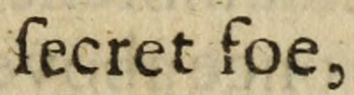
Modern readers often confuse the long s with the letter ⟨f⟩ (minuscule form of ⟨F⟩) as, in some roman and blackletter typefaces, it has an f-like nub at its middle but only on the left side. There was usually no nub in the italic type form of long s, which gave the stroke a descender that curled to the left.
The nub acquired its form in the blackletter style of writing. What looks like one stroke was actually a wedge pointing downward. The wedge's widest part was at that height (x-height) and capped by a second stroke that formed an ascender that curled to the right. Those styles of writing, and their derivatives in type design, had a crossbar at the height of the nub for letters f and t, as well as for k.
Ligatures


The long s was used in ligatures in various languages. Four examples were ⟨si⟩, ⟨ss⟩, ⟨st⟩, and the German letter Eszett⟨ß⟩.

The present-day German letter ß (German: Eszett or scharfes s; also used in Low German and historical Upper Sorbianorthographies) is generally considered to have originated in a (Fraktur) ligature of ⟨ſz⟩ (which is supported by the fact that the second part of the ⟨ß⟩grapheme usually resembles a Fraktur z: ⟨⟩, hence ⟨ſ⟩), although in Antiqua, the ligature of ⟨ſs⟩ is used instead. An alternative hypothesis claims that the German letter ß originated in Tironian notes.[9]
ſ and s as distinct letters
Some old orthographic systems of Slavonic and Baltic languages used ⟨ſ⟩ and ⟨s⟩ as two separate letters with different phonetic values. For example, the Bohorič alphabet of the Slovene language included ⟨ſ⟩/s/, ⟨s⟩/z/, ⟨ſh⟩/ʃ/, ⟨sh⟩/ʒ/. In the original version of the alphabet, majuscule ⟨S⟩ was shared by both letters.
Decline

In general, the long s fell out of use in roman and italic typefaces in professional printing well before the middle of the 19th century. It rarely appears in good-quality London printing after 1800, though it lingers provincially until 1824 and is found in handwriting into the second half of the nineteenth century,[11] and is sometimes seen later on in archaic or traditionalist printing such as printed collections of sermons. Woodhouse's The Principles of Analytical Calculation, published by the Cambridge University Press in 1803, uses the long s throughout its roman text.[12]
Abandonment by printers and type founders
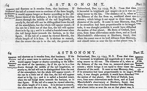
The long s disappeared from new typefaces rapidly in the mid-1790s, and most printers who could afford to do so had discarded older typefaces by the early years of the 19th century. Pioneer of type design John Bell (1746–1831), who started the British Letter Foundry in 1788, is often "credited with the demise of the long s".[13] Paul W. Nash concluded that the change mostly happened very fast in 1800, and believes that this was triggered by the Seditious Societies Act. To discourage subversive publications, this required printing to name the identity of the printer, and so in Nash's view gave printers an incentive to make their work look more modern.[14]
Unlike the 1755 edition, which uses the long s throughout,[15] the 1808 edition of the Printer's Grammar describes the transition away from the use of the long s among type founders and printers in its list of available sorts:
The introduction of the round s, instead of the long, is an improvement in the art of printing equal, if not superior, to any which has taken place in recent years, and for which we are indebted to the ingenious Mr. Bell, who introduced them in his edition of the British Classics [published in the 1780s and 1790s]. They are now generally adopted, and the [type founders] scarcely ever cast a long s to their fonts, unless particularly ordered. Indeed, they omit it altogether in their specimens ... They are placed in our list of sorts, not to recommend them, but because we may not be subject to blame from those of the old school, who are tenacious of deviating from custom, however antiquated, for giving a list which they might term imperfect.
—Caleb Stower, The Printer's Grammar (1808).[16]
An individual instance of an important work using s instead of the long s occurred in 1749, with Joseph Ames's Typographical Antiquities, about printing in England 1471–1600, but "the general abolition of long s began with John Bell's British Theatre (1791)".[11][b]
في إسبانيا، تمّ التغيير بشكل رئيسي بين عامي 1760 و1766؛ [ 14 ] فعلى سبيل المثال، اعتمدت موسوعة إسبانيا ساغرادا متعددة المجلدات هذا التغيير بدءًا من المجلد السادس عشر (1762). وفي فرنسا، حدث التغيير بين عامي 1782 و1793: حيث صمّم فرانسوا ديدو خط ديدون ليُستخدم بشكل أساسي بدون حرف السين الطويل . [ 14 ] وحدث التغيير في إيطاليا في نفس الفترة تقريبًا: حيث صمّم جيامباتيستا بودوني أيضًا خط بودوني بدون حرف السين الطويل . [ 14 ] توقف الطابعون في الولايات المتحدة عن استخدام حرف "s" الطويل بين عامي 1795 و1810؛ فعلى سبيل المثال، نُشرت قوانين الكونغرس بحرف "s" الطويل طوال عام 1803، ثم تحولت إلى حرف "s" القصير في عام 1804. وفي الولايات المتحدة ، كان آخر استخدام لحرف "s" الطويل في موسوعة لو ، التي نُشرت بين عامي 1805 و1811. وكانت إعادة طبعها في عام 1816 من آخر استخدامات هذا الحرف المسجلة في الولايات المتحدة. أما أحدث استخدام مسجل لحرف "s" الطويل في طباعة الأناجيل الإنجليزية، فيمكن العثور عليه في طبعة لونينبورغ، ماساتشوستس ، عام 1826، التي طبعها دبليو. غرينو وابنه. استُخدمت نفس الطباعة في طبعة عام 1826 التي طبعتها لاحقًا شركة دبليو. غرينو وأبناؤه، كما استخدمت قوانين مستعمرة نوفا سكوتيا التابعة للمملكة المتحدة حرف "s" الطويل حتى عام 1816. ومن الأمثلة على استخدام حرفي " s" الطويل والقصير في بعض أنواع الخطوط والمطبوعات المعروفة في المملكة المتحدة ما يلي:
- يحتوي خط كاسلون لعام 1732 على حرف s الطويل . [ 17 ]
- يحتوي خط كاسلون لعام 1796 على حرف s القصير فقط. [ 17 ]
- في المملكة المتحدة، قامت صحيفة التايمز اللندنية بالتحول من استخدام حرف السين الطويل إلى حرف السين القصير مع عددها الصادر في 10 سبتمبر 1803.
- يحتوي خط كاثروود لعام 1810 على حرف s القصير فقط. [ 17 ]
- كانت الطبعة الخامسة من موسوعة بريتانيكا ، التي اكتملت في عام 1817، آخر طبعة تستخدم حرف s الطويل . [ 18 ] أما الطبعة السادسة لعام 1823 فتستخدم حرف s القصير.
- يحتوي خط كاسلون لعام 1841 على حرف s القصير فقط. [ 17 ]
- يحتوي نوعان من الخطوط من تصميم ستيفنسون بليك ، وكلاهما من عام 1838 إلى عام 1841، على حرف s القصير فقط. [ 17 ]
عندما بدأت حرب 1812 ، يتضح التباين بين عدم استخدام الولايات المتحدة لحرف "s" الطويل، واستمرار استخدامها من قبل المملكة المتحدة، من خلال استخدام الكونغرس الأمريكي الثاني عشر لحرف "s" القصير في إعلان الحرب الأمريكي ضد المملكة المتحدة ، وعلى النقيض من ذلك، استمرار استخدام حرف "s" الطويل في نص الوثيقة المقابلة لإسحاق بروك رداً على إعلان الحرب من قبل الولايات المتحدة.
يمكن تحديد تاريخ الطبعات المبكرة للشاعر الاسكتلندي روبرت بيرنز التي فقدت صفحة عنوانها من خلال استخدامها لحرف s الطويل ؛ أي أن طبعة جيمس كوري لأعمال روبرت بيرنز (ليفربول، 1800 والعديد من الطبعات المعاد طباعتها) لا تستخدم حرف s الطويل ، بينما تستخدمه الطبعات من ثمانينيات القرن الثامن عشر وأوائل تسعينيات القرن الثامن عشر.
في مجال الطباعة، استمر استخدام حرف "s" الطويل في حالات نادرة، وأحيانًا بارزة، في المملكة المتحدة حتى نهاية القرن التاسع عشر، ربما كجزء من إحياء واعٍ للأنماط القديمة. على سبيل المثال:
- أعادت مطبعة تشيسويك طباعة العهد الجديد لـ Wyclyffite في عام 1848 باستخدام خط Caslon، [ 19 ] باستخدام حرف s الطويل ؛ أعادت مطبعة تشيسويك، التي أدارها تشارلز ويتينغهام الثاني (ابن شقيق تشارلز ويتينغهام ) من حوالي 1832 إلى 1870، طباعة أعمال كلاسيكية مثل حكايات كانتربري لجيفري تشوسر باستخدام خط Caslon الذي تضمن حرف s الطويل .
- تحتوي الطبعة الأولى "القديمة" من رواية ثاكيراي " تاريخ هنري إزموند " (1852)، وهي رواية تاريخية تدور أحداثها في القرن الثامن عشر، على حرف "s" طويل ، وليس فقط عند تكراره كما في كلمة "mistreſs's". [ 20 ] [ 21 ] [ 22 ]
- تم طباعة المجلد الأول من شعر ماري إليزابيث كولريدج ، بعنوان "Fancy's Following" ، والذي نُشر عام 1896، بحرف "s" طويل . [ 23 ]
- كانت مجموعات الخطب تُنشر باستخدام حرف "s" الطويل حتى نهاية القرن التاسع عشر.
In Germany, Fraktur-family typefaces (such as Tannenberg, used by the Deutsche Reichsbahn for station signage, as illustrated above) continued in widespread official use after private use had already largely ceased, until the "Normal Type" decree of 1941 required that they be phased out. The long s survives in Fraktur typefaces.
Eventual abandonment in handwriting


After its decline and disappearance in printing in the early years of the 19th century, the long s persisted into the second half of the century in manuscript. In handwriting used for correspondence and diaries, its use for a single s seems to have disappeared first: most manuscript examples from the 19th century use it for the first s in a double s. For example,
- Charlotte Brontë used the long s, as the first in a double s, in some of her letters, e.g., "Miſs Austen" in a letter to the critic G. H. Lewes, 12 January 1848; in other letters, however, she uses the short s, for example in an 1849 letter to Patrick Brontë, her father.[24] Her husband Arthur Bell Nicholls used the long s in writing to Ellen Nussey of Brontë's death.[25]
- Edward Lear regularly used the long s in his diaries in the second half of the 19th century; for example, his 1884 diary has an instance in which the first s in a double s is long: "Addreſsed".[26]
- Wilkie Collins routinely used the long s for the first in a double s in his manuscript correspondence; for example, he used the long s in the words "mſs" (manuscripts) and "needleſs" in a 1 June 1886 letter to Daniel S. Ford.[27]
بالنسبة لهؤلاء وغيرهم، ربما أوحى استخدام حرف "s" الطويل المكتوب بخط اليد بنوع الخط ونوع من الرسمية، بالإضافة إلى كونه تقليديًا. نشرت مارغريت ماثيوسون كتابها " ملخص ثمانية أشهر كمريضة في المستشفى الملكي بإدنبرة، 1877"، والذي يروي تجاربها كمريضة لدى جوزيف ليستر في المستشفى الملكي بإدنبرة، وذلك بكتابة نسخ منه بخط اليد. [ ج ] وبدلًا من حرف " s" الأول في حرف "s" مزدوج ، أعادت ماثيوسون كتابة حرف "s" الطويل في هذه النسخ، وهي ممارسة شائعة الاستخدام في المراسلات الشخصية والتجارية لعائلتها، التي كانت تعيش في جزيرة ييل النائية في شتلاند . ربما كانت ممارسة استخدام حرف "s" الطويل في الكتابة اليدوية في ييل، كما في غيرها، امتدادًا لتقاليد الطباعة في القرن الثامن عشر، لكنها لم تكن غريبة كعرف في الكتابة اليدوية.
الاستخدام الحديث
يُستخدم الحرف الطويل s في شكله الممدود، مع نازل ملتف على نمط الخط المائل، كرمز التكامل ( ∫ ) في حساب التفاضل والتكامل . استند غوتفريد لايبنتز في كتابة هذا الرمز على الكلمة اللاتينية summa (المجموع)، والتي كتبها ſumma . ظهر هذا الاستخدام لأول مرة علنًا في بحثه "De Geometria" ، المنشور في مجلة Acta Eruditorum في يونيو 1686، [ 28 ] ولكنه كان يستخدمه في مخطوطاته الخاصة منذ 29 أكتوبر 1675 على الأقل. [ 29 ] يُكتب تكامل الدالة f ( x ) بالنسبة لمتغير حقيقي x على الفترة [ a , b ] كما يلي:

في علم اللغة، يُستخدم حرف مشابه ( ʃ ، ويسمى esh ) في الأبجدية الصوتية الدولية ، حيث يمثل الاحتكاكي السنخي الصامت ، وهو الصوت الأول في الكلمة الإنجليزية ship . [ 30 ]
في الدول الإسكندنافية والدول الناطقة بالألمانية، لا تزال آثار حرف "s" الطويل ظاهرة في اللافتات والشعارات التي تستخدم أشكالاً مختلفة من خطوط فراكتور . ومن الأمثلة على ذلك شعارات صحيفتي "أفتنبوستن" و "أدريسيفايسن" النرويجيتين ، وشعار عبوة حلوى "شيسو" الفنلندية، وشعار شركة "ياغرميستر" الألمانية .
يوجد حرف s الطويل في بعض الخطوط الرقمية الحالية من نوع OpenType التي تمثل إحياءً تاريخيًا، مثل Caslon و Garamond و Bodoni . [ 31 ]
استخدمت بعض الأبجديات اللاتينية التي وُضعت في عشرينيات القرن العشرين لبعض اللغات القوقازية الحرف ⟨ſ⟩ لبعض الأصوات المحددة. [ 32 ] وظلت هذه الكتابة مستخدمة فعليًا حتى عام 1938. [ 33 ] وقد تطورت بعضها إلى شكل حرف كبير يشبه حرف الأبجدية الصوتية الدولية ⟨ʕ⟩ .
في نظام الكتابة التركماني لعام 1993 ، كان الحرف ⟨ſ⟩ يُمثل الصوت / ʒ / ؛ إلا أنه استُبدل بحلول عام 1999 بالحرف ⟨ž⟩ . وكان الحرف الكبير ⟨ £ ⟩ ، والذي استُبدل بدوره بالحرف ⟨Ž⟩ . [ 34 ] [ 35 ]
في يونيكود
- U+017F ſ حرف لاتيني صغير طويل S
- U+1E9B ẛ حرف لاتيني صغير طويل S مع نقطة في الأعلى
- U+1E9C ẜ حرف لاتيني صغير طويل S بخط مائل
- U+1E9D ẝ حرف لاتيني صغير طويل S ذو خط مرتفع
- U+FB05 ſt LATIN SMALL LIGATURE LONG ST
Solidus أو slash
لا يزال صدى حرف السين الطويل موجودًا حتى اليوم في شكل العلامة /، المعروفة شعبيًا باسم " الشرطة المائلة "، ولكن اسمها الرسمي هو " الصلادة " . وتُعد هذه العلامة تطورًا لحرف السين الطويل الذي كان يُستخدم كاختصار لكلمة " شلن " في العملة البريطانية قبل النظام العشري، حيث كان يُكتب في الأصل على شكل 7ſ 6d، ثم أصبح لاحقًا "7/6"، أي "سبعة شلنات وستة بنسات". [ 36 ]
معرض
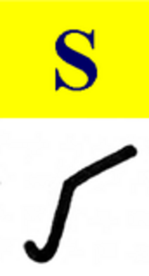 حرف s في منتصف الكتابة الرومانية القديمة
 الأحرف الكبيرة المائلة: حرف s طويل (على اليمين) وحرف s مستدير
 الحروف الطويلة برأس مال وأحرف صغيرة كما هو مستخدم في الإصلاح ، مجلة Allgemeiner Verein für vereinfachte Rechtschreibung ، في تسعينيات القرن التاسع عشر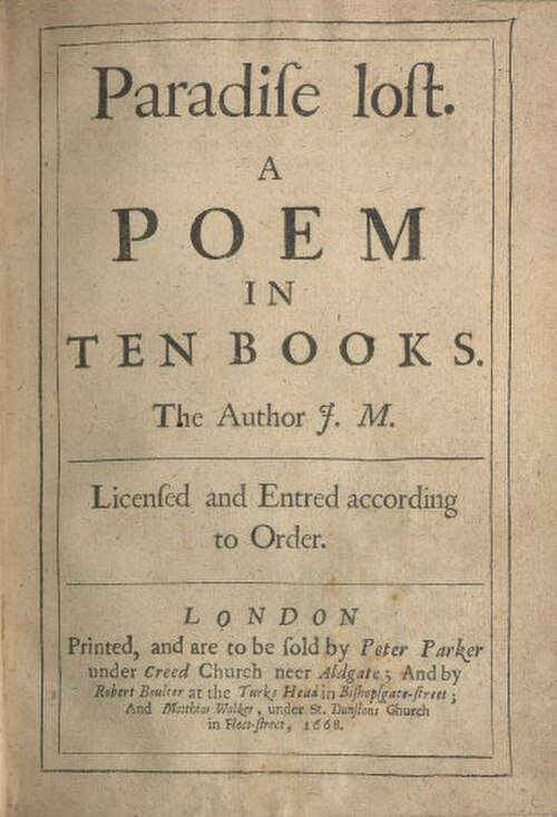
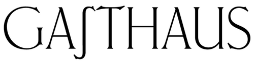 شكل غير معتاد لحرف "s" الطويل في خط Ehmcke-Antiqua
 Wayside cross near Hohenfurch, Germany, erected 1953, showing the long s in a roman typeface
 Detail of a memorial in Munich, Germany, showing the text Wasser-Aufsehers-Gattin ('water attendant's wife') containing a long s adjacent to an f
 A page from an edition of The New England Primer published in 1813 in Haverhill, Massachusetts, showing the alphabet with ligatures and double letters, including long ess (ſ)
See also
- ß (Eszett) – Letter of the Latin alphabet; used in the German language
- Insular S – Insular form of the letter S (Ꞅ)
- Esh (letter) – Character and IPA symbol (Ʃ, ʃ)
- Integral Symbol (∫) – Mathematical symbol used to denote integrals and antiderivatives
- R rotunda – Variant of the Latin letter R (ꝛ)
- Long I – Letter variant
- Sigma – Eighteenth letter of the Greek alphabet (Σ) similarly has two lowercase forms, ς in word-final position and σ otherwise
- Cool S - stylized children's doodle of the letter S
Notes
- ↑Depending on whether they appear in the end or middle of a word, respectively. Some texts starting from the late 18th century had it exclusively replace the first s, however. A more detailed explanation follows below.
- ↑For fuller information, Attar cites: Nash, Paul W. (2001). "The Abandoning of the Long 's' in Britain in 1800". Journal of the Printing Historical Society (3): 3–19.
- ↑The still-unpublished manuscript of this Sketch is held by the Shetland Museum and Archives.
References
- 1234West, Andrew (June 2006). "The Rules for Long S". Babelstone (blog). Archived from the original on 1 August 2020. Retrieved 26 November 2019.
- ↑Berger, Sidney (2016). The Dictionary of the Book: A Glossary for Book Collectors, Booksellers, Librarians, and Others. Rowman & Littlefield. pp. 252, 295. ISBN 9781442263390.
- ↑Cheng, Karen (2006). Designing Type. Laurence King Publishing. p. 212. ISBN 9781856694452.
- ↑Everson, Michael (1 October 2020), L2/20-267: Revised proposal to add two characters for Middle Scots to the UCS(PDF), Unicode Consortium
- ↑Anthony Ashley Cooper Earl of Shaftesbury (1705). The Earl of Shaftsbury's Case Upon the Habeas Corpus Act. printed, for G. Sawbridge.
- 12Lowe's 1800 map of the USA
- ↑Yule, John-David. Concise Encyclopedia of Science and Technology. Crescent Books (1978) ISBN 9780517486108 p. 490
- ↑Davies, Lyn (2006), A is for Ox, London: Folio Society.
- ↑Bollwage, Max (1999). "Ist das Eszett ein lateinischer Gastarbeiter?". Gutenberg-Jahrbuch[Gutenberg Yearbook] (in German). Gutenberg-Gesellschaft. pp. 35–41. ISBN 978-3-7755-1999-1. Cited and discussed in: Stötzner, Uta (2006). "Die Geschichte des versalen Eszetts". Signa (in German). 9. Grimma: 21–22. ISBN 978-3-933629-17-3.
- ↑Kapidakis, Sarantos; Mazurek, Cezary; Werla, Marcin (2015). Research and Advanced Technology for Digital Libraries. Springer. pp. 257–260. ISBN 9783319245928. Archived from the original on 20 July 2023. Retrieved 20 July 2023.
- 12Attar, Karen (2010). "S and Long S". In Michael Felix Suarez; H. R. Woudhuysen (eds.). Oxford Companion to the Book. Vol. II. Oxford University Press. p. 1116. ISBN 9780198606536..
- ↑Woodhouse, Robert (1 January 1803). The principles of analytical calculation. Printed at the University press.
- ↑Bell, John (2010). Michael Felix Suarez; H. R. Woudhuysen (eds.). Oxford Companion to the Book. Vol. I. Oxford University Press. p. 516. ISBN 9780198606536.
- 1234Nash, Paul W. (2001). "The abandoning of the long s in Britain in 1800". Journal of the Printing Historical Society. Archived from the original on 28 May 2023. Retrieved 28 May 2023. Noted in Morgan, Paul (2002). "The Use of the Long 's' in Britain: a Note". Quadrat (15): 23–28. Archived from the original on 28 May 2023. Retrieved 28 May 2023.
- ↑Smith, John (1755). The printer's grammar: containing a concise history of the origin of printing;. London.
- ↑Stower, Caleb (1808). The Printer's Grammar; Or Introduction to the Art of Printing: Containing a Concise History of the Art, with the Improvements in the Practice of Printing, for the Last Fifty Years. p. 53. Archived from the original on 26 March 2023. Retrieved 22 March 2023.
- 12345Philip Gaskell, New Introduction to Bibliography, Clarendon, 1972, p. 210, Figs 74, 75.
- ↑Encyclopædia Britannica (5th ed.). 1817..
- ↑Wells, John Edwin (1970). A Manual of the Writings in Middle English 1050–1500. Modern Language Association of America. p. 548..
- ↑Daniel Hack (2005). The Material Interests of the Victorian Novel. Victorian Literature and Culture series. University of Virginia Press. p. 12. Figure 1 prints a facsimile of a sample page.
- ↑J. A. Sutherland (2013). "Henry Esmond: The Virtues of Carelessness". Thackeray at Work (reprint). Bloomsbury Academic Collections: English Literary Criticism: 18th–19th Centuries. London and New York: Bloomsbury Academic: 56–73. doi:10.5040/9781472554260.ch-003.
- ↑Mosley, James. "Recasting Caslon Old Face". Type Foundry. Archived from the original on 29 June 2015. Retrieved 1 August 2015.
- ↑Coleridge, Mary (1896). Fancy's Following. Oxford: Daniel Press.
- ↑Smith, Margaret, ed. (2000). The Letters of Charlotte Brontë: With a Selection of Letters by Family and Friends. Vol. Two (1848–1851). Oxford: Clarendon Press. pp. 406 and 407..
- ↑Smith, Margaret, ed. (2004). The Letters of Charlotte Brontë: With a Selection of Letters by Family and Friends. Vol. Three (1852–1855). Oxford: Clarendon Press. p. opposite 217..
- ↑Edward Lear. Edward Lear Diaries, 1858–1888. Houghton Library, Harvard: MS Eng 797.3 (27). Archived from the original on 22 February 2014.
- ↑Collins, Wilkie. "To Daniel S. Ford". In Paul Lewis (ed.). The Wilkie Collins Pages: Wilkie's Letters. Archived from the original on 15 August 2020. Retrieved 7 February 2014.
- ↑Swetz, Frank J. "Mathematical Treasure: Leibniz's Papers on Calculus – Integral Calculus". Convergence. Mathematical Association of America. Archived from the original on 27 December 2016. Retrieved 11 February 2017.
- ↑Leibniz, G. W. (2008) [29 October 1675]. "Analyseos tetragonisticae pars secunda". Sämtliche Schriften und Briefe, Reihe VII: Mathematische Schriften(PDF). Vol. 5: Infinitesimalmathematik 1674–1676. Berlin: Akademie Verlag. pp. 288–295. Archived from the original(PDF) on 9 October 2021. Retrieved 26 October 2019.
- ↑The International Phonetic Alphabet by the International Phonetic Association.
- ↑Strizver, Ilene (2014). Type Rules!: The Designer's Guide to Professional Typography (4th ed.). Hoboken, New Jersey: Wiley. p. 34. ISBN 978-1-118-45405-3.
- ↑Proposal to encode Latin letters used in the Former Soviet Union (in Unicode)(PDF), DK UUG, archived(PDF) from the original on 23 May 2012, retrieved 22 December 2011.
- ↑Frings, Andreas (2007). Sowjetische Schriftpolitik zwischen 1917 und 1941 – eine handlungstheoretische Analyse[Soviet scripts politics between 1917 and 1941 – an action-theoretical analysis] (in German). F. Steiner. ISBN 978-3-515-08887-9..
- ↑Ercilasun, Ahmet B. (1999). "The Acceptance of the Latin Alphabet in the Turkish World"(PDF). Studia Orientalia Electronica. 87: 63–70. ISSN 2323-5209. Archived(PDF) from the original on 18 November 2023. Retrieved 19 November 2023.
- ↑ "الأبجدية الرومانية للغة التركمانية" . معهد اللغة الإستونية . مؤرشف من الأصل في 24 أغسطس 2023. تم الاطلاع عليه في 19 نوفمبر 2023 .
- ↑ فاولر، فرانسيس جورج (1917). "solidus". قاموس أكسفورد الموجز للغة الإنجليزية المعاصرة . ص 829 - عبر archive.org.
solidus
، اسم (جمع: s). (تاريخيًا) عملة ذهبية طرحها الإمبراطور الروماني قسطنطين؛ (فقط بالاختصار
s.
) شلن (شلن)، مثل 7 شلنات و6 بنسات، وجنيه إسترليني واحد وشلن واحد؛ خط الشلن (لـ
ſ
أو
s
الطويل ) كما في 7/6. [استخدام LL لـ L
SOLID
us]
(اسم الشلن مشتق من عملة رومانية، وهي السوليدوس .)
روابط خارجية
- مور. "شرح بسيط للاستخدام الصحيح لحرف السين الطويل والقصير" . أليس – عبر موقع Imgur.
- موسلي، جيمس (يناير 2008). "حرف s طويل" . تايب فاوندري - عبر بلوج سبوت.
- لماذا استخدم كتّاب القرن الثامن عشر حرف الفاء بدلاً من حرف السين؟ قسم "الأدب الكلاسيكي". ذا ستريت دوب . 6 نوفمبر 1981. مؤرشف من الأصل في 4 سبتمبر 2008. تم الاطلاع عليه في 19 مارس 2003 .
- ويست، أندرو (يونيو 2006). "الطول والقصير لحرف S" . بابلستون .
- "إعلان الاستقلال الأمريكي مع حرف السين الطويل" . Unknown.nu .
- تاريخ اللغة الإنجليزية
- الطباعة
- الحروف الباليوجرافية
- حروف لاتينية
- الرسائل بصيغتها النهائية